Have you ever wanted to see a trend in your data at a glance? Do you sometimes want time-based context on simple values in a table to determine whether you’re winning or losing? One of the easiest ways to visualize these concepts concisely is through sparklines.
What is a sparkline? Put simply, it’s a cell in your table or matrix which visualizes the data across some axis (usually time). A table with a sparkline may look something like this:
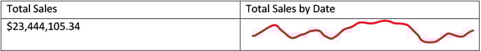
As you can see, the line cell shows you very clearly that sales are kind of in the middle of your recent trends but seems to be on an upward trajectory. This is a much more nuanced picture than seeing the total amount by itself.
And now this helpful visualization mechanic has come to Power BI Desktop with the feature entering preview this month (December 2021).
How to Get Started
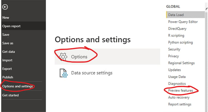
Before you can add sparklines to your visualizations, you need to opt into the preview feature. To ensure your Power BI application is opted in, click File at the top, then choose Options and Settings. Then click Options. In the menu that appears, choose Preview Features.
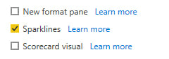
Ensure that the Sparklines box is checked.
Now sparklines are available in your instance of Power BI Desktop. Let’s try it out!
Adding a Sparkline to a Table in Power BI
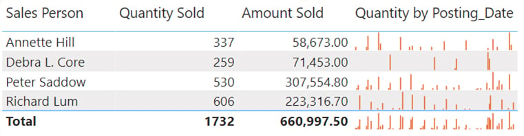
Using whatever data you have available, make a simple table visual. I will use this straightforward “Sales by Salesperson” table.
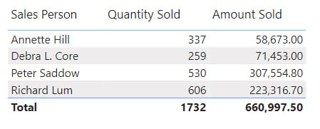 Pretty ho-hum, huh? Let’s add a bit more interest to the visual!
Click your table visual; then, in the right pane, you’ll see your visualization options, including which fields are chosen for your table.
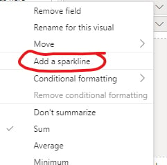
I will start using the Quantity Sold field, but you can use any numerical field for a sparkline. Click the small arrow on the right side of the field name and choose the option Add a Sparkline.
You will be asked what other field you want to use as your axis. I highly recommend using a date field, but you can try something else if you wish. I’m going to select Posting Date as my axis field. You can also try other types of summarization to show averages, for instance.
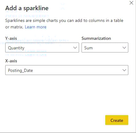
Hit Create, and then check out your table!
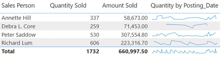
You now have a sparkline showing how much each salesperson sold (in quantity) over time, or at least an idea of the trend. You can change how your sparkline appears in the visualizations pane under formatting. You’ll see a new section for Sparklines. You can even switch to a column graph instead of a line.
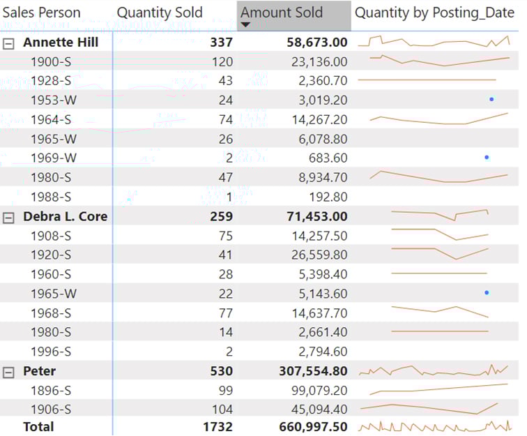
That’s pretty cool, but there’s even more to it; you can use sparklines on Matrix visuals, too. Let’s say, for instance, I want to have another category in my chart for the item type. I convert my table into a matrix by selecting the Visualizations pane option and adding that field to the row list. Now I can see sparklines for each product each salesperson sold, and the subtotal lines that bring them together into groups.
Better Analysis with Power BI
Sparklines are just one of the many ways you can understand your data better with Power BI. This advanced business intelligence toolkit connects to just about anything and provides a cloud-based data headquarters with all the reports you need to make better decisions.
Learn more about Power BI and how Innovia Consulting can help you get started!