At Innovia Consulting, we developed a portfolio of reports in Power BI to help you see the meaning behind your data. With visualizations, tables connected to multiple data sources within your Business Central, and calculations of several KPIs built-in, these report packs can help you analyze your business operations and give you the information you need to make critical business decisions.
Our selection of templates can help your business visualize and monitor its data for accounting, purchasing, production, inventory, and sales & marketing. With 25+ templates currently available, you are bound to find several that meet your business needs.

See How Innovia’s Power BI Reports Can Help Your Departments.
Click on the headings below to see all of our report options available for each department. Or view them all in a convenient PDF format.
Aged Payables
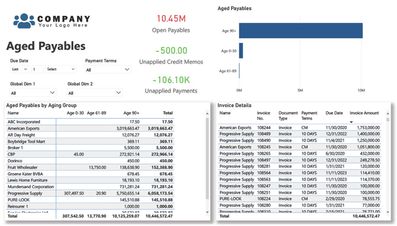
The Aged Payables page in this Power BI report provides a comprehensive overview of the company's outstanding invoices and how long they have been outstanding. The page displays a table that breaks down the aging of payables by vendor, showing the number of outstanding invoices for each vendor broken down by into Groups 0-30 days, 31-60 days, 61-90 days, and 90+ days. This allows you to quickly identify which vendors have the most overdue invoices and how long they have been outstanding.
By using this report page, you can easily identify which vendors' invoices are overdue for payment, how long the payments have been outstanding, and how this is impacting your company's cash flow. This information can help you make informed decisions about how to prioritize payments to vendors and manage your accounts payable effectively.
Aged Receivables
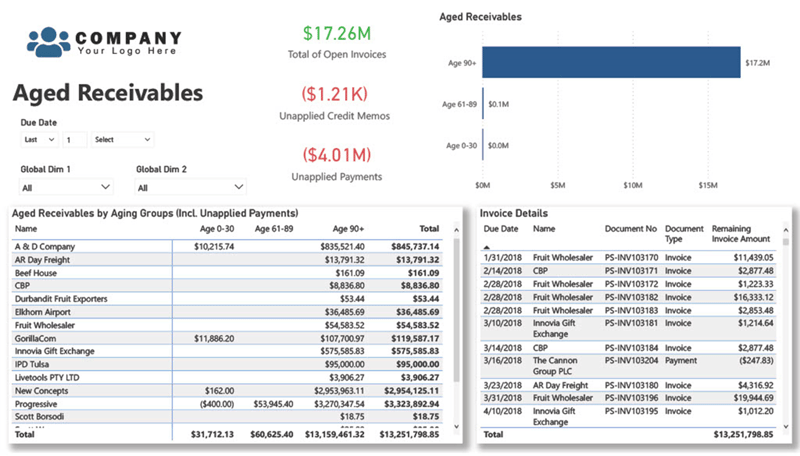
The Aged Receivables page in this Power BI report provides an overview of the company's outstanding invoices and how long they have been outstanding. The report displays a table that breaks down the aging of the receivables by customer, showing the amount of outstanding invoices for each customer. These are broken Into Groups 0-30 days, 31-60 days, 61-90 days, and 90+ days.
By using this report page, you can easily identify which customers are overdue on their payments, how long the payments have been outstanding, and how this is impacting your company's cash flow. This information can help you make informed decisions about how to prioritize collections efforts and manage your accounts receivable effectively.
Balance Accounts
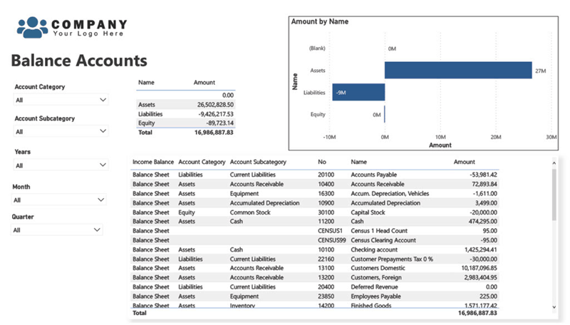
The General Ledger Balance Accounts page in this Power BI report provides a high-level snapshot of the company's balance accounts, broken down by account category and subcategory. This page is designed to provide a quick overview of the company's financial position without going into the level of detail typically found in a balance sheet.
The page displays a table that lists all balance accounts, grouped by category and subcategory, and includes the account name, account code, and the total balance associated with each account. The table is interactive and allows you to drill down into specific account categories and subcategories to see more detailed information.
In addition to the table, the page also includes a chart that shows the breakdown of balance accounts by category and subcategory, providing a visual representation of the company's financial position. This chart can be useful for identifying trends or patterns in the company's financial position and can be used to inform strategic decision-making.
General Ledger Detail
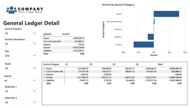
The General Ledger Detail page in this Power BI report provides a detailed view of all the transactions in the company's general ledger.
This page also includes the ability to filter the transactions by general ledger account categories and subcategories, making it easy to focus on specific account types such as expenses, revenue, or assets. This feature can be used to quickly identify trends or anomalies in specific account categories and can be especially useful for budgeting and forecasting.
Overall, the General Ledger Detail page in this Power BI report provides a comprehensive and flexible view of the company's financial transactions, making it easy to identify trends, investigate discrepancies, and monitor financial performance.
Income Accounts
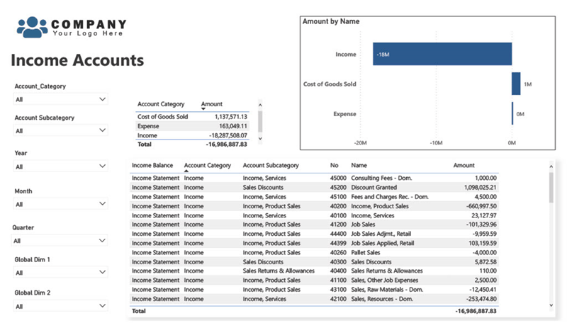
The General Ledger Income Accounts page provides a high-level snapshot of the company's income accounts, broken down by account category and subcategory. This page is designed to provide a quick overview of the company's income streams without going into the level of detail typically found in an income statement.
The page displays a table that lists all income accounts, grouped by category and subcategory, and includes the account name, number, and the total amount of income associated with each account.
In addition to the table, the page also includes a chart that shows the breakdown of income accounts by category, providing a visual representation of the company's income streams. This chart can be useful for identifying trends or patterns in the company's income and can be used to inform strategic decision-making.
Receipts Pending Invoice
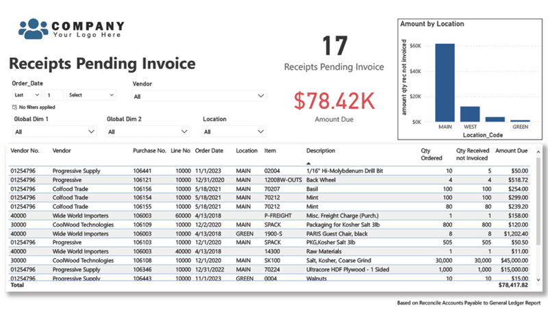
The Receipts Pending Invoice page in this Power BI report provides a detailed view of all vendor receipts that are currently pending the receipt of an invoice. This page displays a table that lists all vendor receipts where items have been received but have yet to be matched to an invoice. This information can be used to help identify and investigate discrepancies between receipts and invoices.
The table provides detailed information about each receipt, including the vendor name & item number, order date, quantity received, quantity ordered, and the amount due.
By using this report page, you can easily identify which vendor receipts are still pending receipt of a vendor invoice and easily identify if action needs to be taken. This information can help you improve your accounts receivable management and cash flow forecasting, ultimately improving your company's financial health.
Purchases by Vendor
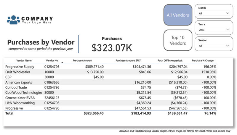
This page is designed to provide insights into the purchasing activity of the organization by comparing the current year's purchases with the same period last year (SPLY). The page consists of a main page and an embedded secondary page: Purchases by Vendor Compared to SPLY and Top 10 Purchases by Vendor Compared to SPLY.
The Purchases by Vendor Compared to SPLY visualization displays tabular data that shows the total purchase amount for each vendor for the current year and the same period last year. This is intended to highlight whether the vendor's purchases have increased, decreased, or remained the same compared to SPLY. This visualization helps identify the vendors with the most significant changes in purchase activity and monitor the trend over time.
The Top 10 Purchases by Vendor Compared to SPLY page displays a table that lists the top 10 vendors in terms of total purchases for the current year and SPLY. The table also shows the percentage change in purchases for each vendor compared to SPLY. This visualization helps identify the vendors that contribute the most to the organization's purchasing activity and the change in their purchasing behavior.
These pages can be filtered by various attributes such as vendor, and time period. By using the filters, users can dive deeper into the data and gain additional insights into the purchasing activity of the organization.
Open Purchase Items
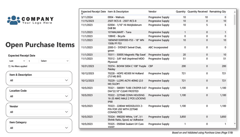
The Open Purchase Items page provides a comprehensive view of all open purchase items that have not yet been received. This page includes a table that lists each open purchase item along with information such as the item code, description, supplier, order date, expected delivery date, order status, and quantity ordered.
Additionally, the Open Purchase Items page includes interactive slicers that allow you to filter purchase items by various criteria such as item code, supplier, order date, or item category. This can help you to quickly identify purchase items that require your attention, such as items that are past their expected delivery date or items that have been partially received.
By using the Open Purchase Items page in this Power BI report, you can gain a better understanding of your purchasing operations, identify potential issues, and take corrective action to improve the efficiency and effectiveness of your procurement processes.
Open Purchase Orders
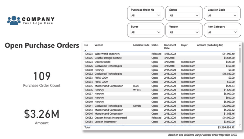
The Open Purchase Orders page provides a detailed view of all open purchase orders that have yet to be received. This page includes a table that lists each open purchase order along with information such as the supplier, document date, buyer, order status, and total amount.
By using the Open Purchase Orders page in this Power BI report, you can gain a better understanding of your purchasing operations, identify potential issues, and take corrective action to improve the efficiency and effectiveness of your procurement processes.
Inventory Aging
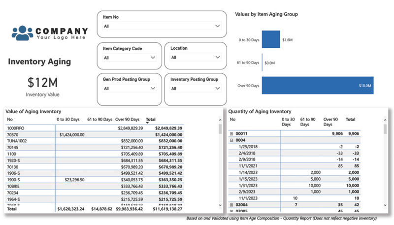
The Inventory Aging page provides a detailed view of the company's inventory aging, broken down by value and quantity. The page includes two tables that provide different views of the inventory data, using the standard aging format of 30, 60, 90, and 90+ days.
The first table on the page shows Inventory Aging by Value, which lists all inventory items and their current value, broken down by the number of days the inventory has been in stock. The aging periods are broken down into four categories: 0-30 days, 31-60 days, 61-90 days, and 90+ days. This table provides a comprehensive view of the company's inventory aging by value, allowing you to identify slow-moving inventory items and potential inventory sales campaign opportunities or write-offs.
The second table on the page shows Inventory Aging by Quantity, which lists all inventory items and their current quantity on hand, broken down by the number of days the inventory has been in stock. Like the first table, the aging periods are broken down into four categories: 0-30 days, 31-60 days, 61-90 days, and 90+ days. This table provides a detailed view of the company's inventory aging by quantity, allowing you to identify slow-moving inventory items and potential inventory sales campaign opportunities or write-offs.
By using the standard aging format, the Inventory Aging page allows you to quickly identify inventory items that are not moving as quickly as expected. This information can be used to inform inventory management decisions, such as adjusting purchasing plans, offering discounts on slow-moving items, or writing off obsolete inventory items.
Inventory Valuation
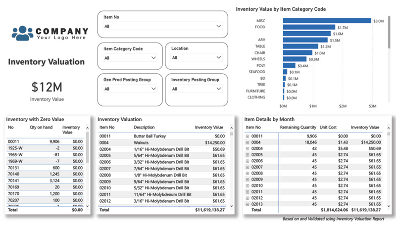
The Inventory Valuation page provides a detailed view of the company's inventory valuation, broken down by item. The page includes three tables that provide different views of the inventory data, as well as a visual that breaks down the inventory value by item category code.
The first table on the page shows Inventory with Zero Value, which lists all inventory items that currently have a zero value. Easily identify inventory items that may need cost adjustments.
The second table on the page shows Inventory Valuation, which lists all inventory items and their current value, broken down by their item number and value. This table provides a comprehensive view of the company's inventory valuation, allowing you to identify trends and patterns in inventory value.
The third table on the page shows Item Details by Month, which lists inventory item details and their associated values for each month. This table allows you to track inventory trends over time and can be used to inform purchasing and inventory management decisions.
In addition to the tables, the page includes a visual that breaks down the inventory value by item category code, providing a visual representation of how inventory value is distributed across different product categories. This chart can be useful for identifying which categories are driving inventory value and can be used to inform inventory management and purchasing decisions.
Overall, the Inventory Valuation page in this Power BI report provides a comprehensive view of the company's inventory value, broken down by item and location, and allows you to track trends and patterns in inventory value over time. The included tables and visuals provide multiple views of the data, allowing you to make informed inventory management and purchasing decisions.
Item Margins
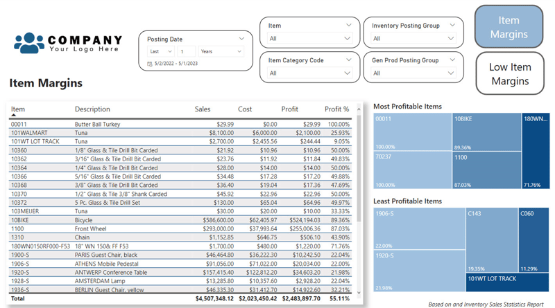
The Item Margins page provides a detailed view of the company's item margins, allowing you to identify which items are most and least profitable. The page includes a table that lists all items, along with their sales, cost, and overall profit margin. The table is sorted by profit margin, with the most profitable items at the top and the least profitable at the bottom. Additionally, there are two tree maps that showcase the top and bottom 5 most and least profitable items, providing a quick visual representation of the profitability of the company's products.
The table on the Item Margins page allows you to analyze item sales and costs, as well as their overall profit margin. By examining this information, you can identify which items are most and least profitable and make informed decisions about pricing, promotions, and inventory management.
This report also includes the Low Item Margins page, a more focused view of the company's least profitable items. This page is filtered to only show items with a net profit margin below 50% and includes the same table and tree maps as the Item Margins page. It's important to note that the threshold for low item margins can vary based on business practices and industry standards. We can be easily modified this threshold to fit your business needs.
By using the Item Margins and Low Item Margins pages in this Power BI report, you can gain valuable insights into the profitability of the company's products. These insights can be used to inform pricing strategies, promotional campaigns, and inventory management decisions, ultimately helping to improve the company's overall profitability.
Item Profitability
The Item Profitability page provides a detailed view of the profitability of each item sold by the company. This page is designed to help you understand which items are driving profitability and which items may be negatively impacting the company's bottom line.
The page displays a table that lists all items sold, including the item name, item code, total revenue, total cost, and gross profit for each item. The table is interactive and allows you to sort and filter the data to focus on specific items or time periods.
In addition to the table, the page includes a chart that shows the top 5 most profitable items ranked by gross profit. This chart can be useful for identifying which items are generating the most profit for the company. This report can be used in product development and marketing strategies.
Overall, the Item Profitability page in this Power BI report provides a comprehensive view of the profitability of each item sold by the company, allowing you to identify trends, investigate discrepancies, and optimize pricing strategies to improve overall profitability.
Items by Location
The Items by Location page provides a detailed view of the quantity of items that are located in each location. The page includes a table that lists all locations, along with the total quantity of items that are currently in stock at each location. The table is sorted by location, allowing you to quickly identify which locations have the highest and lowest inventory levels.
By examining this information, you can gain valuable insights into how inventory is distributed across different locations. This can help you to identify areas where inventory levels may require attention and make informed decisions about inventory management and distribution.
Customer Geographics
The Customer Geographics page allows you to visualize the geographic distribution of your customers based on their country.
The first section of the page is dedicated to Domestic Customers. It shows a table that displays the net sales for each customer in the domestic market along with their location, longitude/latitude by 5-digit zip code. The table includes the net sales value for that customer.
The second section is dedicated to International Customers. It displays a similar table, but this time it shows the net sales for each customer in the international market along with their location, using country-level granularity. The table includes the net sales value for that customer.
You can use the interactive map visualizations to filter and highlight different countries or regions and see how it impacts the overall net sales. This page is useful for gaining insights into your customer base and identifying areas of potential growth or challenges in different regions.
International Sales
The International Sales page provides an overview of sales performance across different countries outside the US. The page contains a tabular chart that breaks down the sales by country and month. The table allows users to filter the data by country, month, or year to identify trends and patterns in sales performance.
In addition to the tabular chart, the page also includes an interactive map visual that shows the geographical distribution of sales. The map provides an intuitive way to visualize sales performance across different regions and countries. Users can zoom in and out of the map to explore sales performance in specific regions or countries.
This page provides valuable insights into the company's international sales performance and can help identify areas of opportunity or concern. By analyzing the data by country and month, users can identify trends and patterns in sales performance and make informed decisions to optimize their international sales strategy.
Open Sales Orders
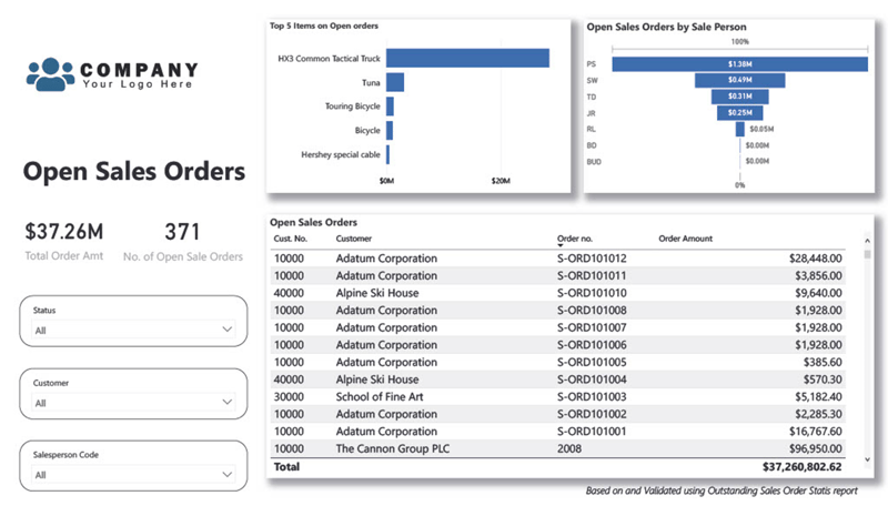
The Open Sales Orders page provides an overview of all open sales orders, allowing sales managers to keep track of sales orders that need attention. The page includes a tabular chart that displays a list of open sales orders, including customer name, salesperson name, order number, order date, and order amount.
In addition to the tabular chart, the page also includes a chart that shows the top 5 items on open sales orders, which can help sales managers identify popular items that are in demand. The chart can be filtered by the salesperson to show who has the most open sales orders.
Lastly, the page includes a chart that displays the open sales orders by salesperson, allowing sales managers to quickly identify which salespeople have the most open orders and need to focus on closing them. This can help to ensure that all sales orders are processed in a timely manner, which can ultimately lead to increased customer satisfaction and sales revenue.
Sales by Customer
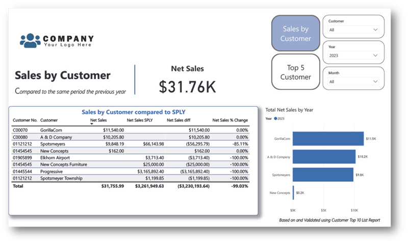
The Sales by Customer page provides a high-level overview of the company's net sales performance compared to the previous year. It includes a table that breaks down net sales by customer and compares it to the same period in the prior year, with a net sales difference and percent change. The table can be filtered by year, month, or other time periods.
In addition, the Top 5 Sales by Customer page provides a more detailed view of the company's top customers based on net sales. This page includes a bar chart that displays the net sales of the top five customers, with a comparison to the prior year's sales for each customer.
Both pages provide insights into the company's sales performance and help identify trends and areas for improvement. They can be used by sales teams to focus their efforts on high-performing customers and by executives to monitor overall sales growth and identify opportunities for expansion.
Sales by State
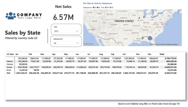
The Sales by State page provides a high-level overview of sales data across different US states. The page includes a tabular chart that breaks down sales by state for each month. This allows users to easily compare sales trends across different states and identify any patterns or anomalies in the data.
In addition to the tabular chart, the page also includes an interactive map visual that highlights the regions with the highest sales. This visual allows users to quickly identify the states that are driving the most sales and compare them to other states. Users can interact with the map by hovering over each state to see the sales data for that state or clicking on a state to filter the data for that state.
Overall, the Sales by State page provides a comprehensive view of sales data across different US states and allows users to easily identify trends and patterns in the data.
Sales Tax Nexus Evaluation
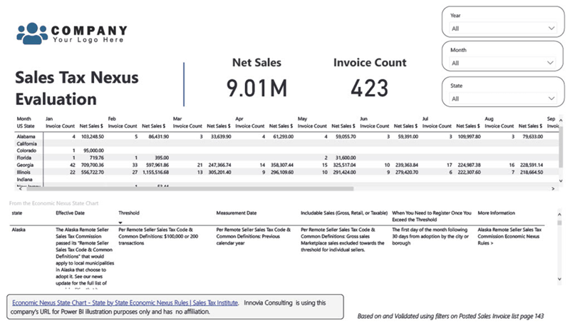
The Sales Tax Nexus Evaluation page provides an overview of the company's invoice count and net sales by month, along with information on its sales tax requirements by state from an independent URL. Innovia is using this URL used for illustration purposes only and has no affiliation. The page includes a tabular chart that displays the monthly totals for invoices and net sales.
The sales tax nexus is an important factor to consider when determining the company's sales tax obligations. By understanding the nexus, which is the level of connection between the company and a particular state, the company can better determine its sales tax obligations.
Overall, this page provides a high level of understanding for where your company may fit in the Sale Tax Nexxus scheme.
Sales Comparison Overview
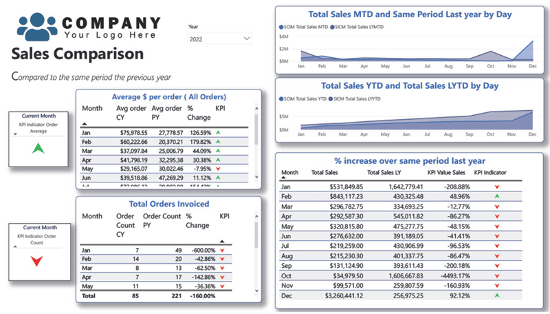
The Sales Comparison Overview page in the Power BI report provides a high-level overview of sales performance. It includes visualizations that show the average dollar amount per order by month, the total number of orders invoiced by month, and sales trends over time using a year-to-date (YTD), month-to-date (MTD), and same period last year (SPLY) model.
The first visual displays the average dollar amount per order by month in a table format. It allows the user to easily identify any significant changes in average order value over time.
The second table shows the total number of orders invoiced by month. It allows the user to identify any seasonality or trends in order volume.
Other page features include various visuals showing sales trends over time using a YTD, MTD, and SPLY model. The user can select a specific year or month to view sales data for that time.
Overall, this page provides a quick and easy way to assess the performance of sales by identifying trends and comparing performance across time periods.
Change Log Monitor & Field Setup
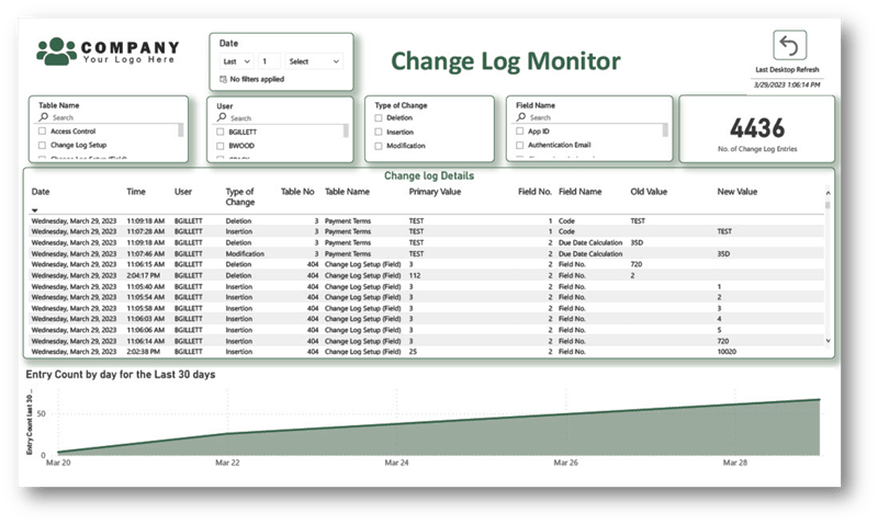
This page is intended to provide easy access to the Change log entries. This page is completely interactive so you can easily identify changes made to table data in your system. This report contains a relative date slicer that can be used to review last day, last month etc.
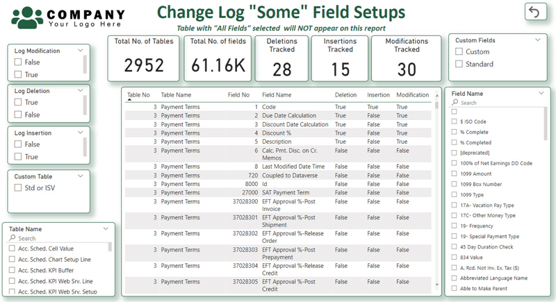
The Field Setup page is intended to provide the user with insights for tracking change log setups when Using “Some” fields functionality in Business Central. The page answers questions about what you are currently monitoring, and this page can also help you locate the fields that you may want to track.