Microsoft has invested heavily in its business intelligence (BI) and analytics platforms for over 12 years. As one of the most widely used data visualization tools in the world, Power BI has made some huge improvements to creating custom visualizations that we want to share with you.
Whether you are using the free desktop version or the paid professional version, one of the biggest challenges with Power BI is customizing your dashboards and reports to fit your analytical requirements. While all versions come equipped with a library of visualization templates, and there are some industry-specific content packs (including pre-built reports, dashboards, Excel workbooks, and datasets) all out-of-the-box, most organizations will need to make alterations to these assets to better fit their operations.
When creating or editing a Power BI dashboard, you have access to a ton of different types of visuals. There are visuals that come pre-packaged when you download Power BI desktop or open the Power BI service, and there are custom visuals that you can choose to use.
Custom Visuals for Power BI
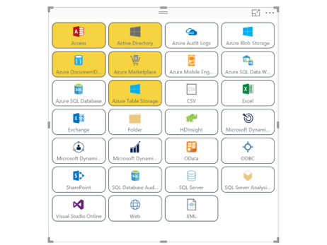
Defined by Microsoft, “Custom visuals are packages that include code for rendering the data served to them.” Custom visuals are an effective way to enable your business users to see the data they need to see in a way they need to see it. In the ribbon bar, you will see a “Custom Visuals” section where you have the option to choose “From Marketplace” or “From File.”
The Marketplace, aka AppSource, includes a rich library of fully customizable, open-source data visualizations that you can search for and import into your Power BI solution. Once you find the charts or advanced analytics you want to use, you can download it, and the new icon will appear under your Visualizations bar. Now you can add it to any report or dashboard and start using it immediately.
The other kind of custom visual is creased for your organization, to be used internally. Developers create custom visuals using the custom visuals SDK in GitHub, where they can create visuals based on well-known JavaScript libraries such as D3, jQuery, and even R-language scripts. Once these custom visuals are tested, debugged, and packaged, report authors can import the custom visual files (.pbiviz file) into their reports and use them as they would any other Power BI visual. They can be filtered, highlighted, edited, and shared across all Power BI products.
We’ve taken a few samples off Microsoft to show you what kind of custom visuals currently exist on AppSource:
- Slicers = Alternative way of filtering to narrow the portion of a dataset
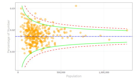
- Funnel Plot = Use R visuals and R scripts to find outliers in your data
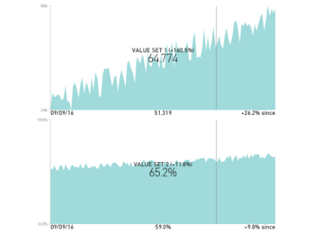
- Dual KPI Chart = Shows two measures over time on a joint timeline
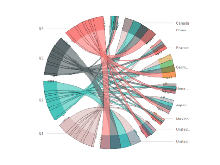
- Chord Chart = Displays inter-relationships between data in a matrix
Find more Power BI custom visual samples here.
When to Use Custom Visuals for Power BI?
Custom visuals are a great opportunity to gain deeper insight into your data. Power BI is full of amazing pre-built visualizations, but your business is unique, and so are your data needs. Custom visuals can be used by anyone with the Power BI platform who needs better filtering options, detailed charts, interactive drill-down capabilities, or even industry-specific visuals to improve their dashboards and reports. At the end of the day, it’s about making improvements to the way your organization consumes data and makes decisions.
Take a look at all the current Power BI custom visuals available on AppSource here.
How Use Custom Visuals for Power BI
Microsoft provides some great documentation on how to get started with custom visuals. So, we’ve compiled a bunch of stuff from their website and provided some quick links! Here is everything you need to design, publish, and use your custom visuals in Power BI:
- Step 1: Decide if the custom visuals you need exists in the Marketplace currently. If they don’t (or if the one you find is not certified), you will need to work with a developer to build and publish your organization’s custom visual. Make sure to provide your technical staff with a clear concept and parameters for what they will be designing.
- Step 2: Calling all developers! Start coding your custom visual with the custom visuals SDK on GitHub. Here is the developers guide to get you started – Custom Visuals Guidelines. You should also check out this 40-minute video – Custom Visuals Tutorial
- Step 3: Once you have a working visual, you will need to test, debug, and prepare your custom visuals for use in Power BI Desktop or AppSource.
- Step 4: The next step is to get your custom visual certified by Microsoft. The certification process is optional and depends on if you want to make it available to the public on AppSource. If you want your visual to be public, you have to meet all certification requirements and submit an application to the Power BI Custom Visuals Support team.
- Step 5: Finally, it’s time to get your custom visual into the hands of the public or the people in your organization. For organizational custom visuals, all you have to do is deploy it into your organizational store. Users can select the custom visual from the “My Organization” tab under Visualizations. If you have chosen to make your visuals available on AppSource, you have to submit it to AppSource in the developer center. After submission, you will be able to view the submission status in your app dashboard.
Start Using Power BI in 5 Minutes with Jet Analytics
Before you can get started creating stunning custom visuals that work for your business, you need to make sure your Power BI solution is setup optimally. Contrary to what you may have heard, Power BI does not house, transfer, or normalize data from multiple data sources. So, if you want to start creating visuals based on the most accurate, up-to-date data in your organization, you need to make sure your data is in order first.
If you’re not sure where to get started, you’re in luck. Jet Analytics is a business intelligence and reporting solution that is used to speed your time to delivery with Power BI. With a pre-built data warehouse and cubes, Jet Analytics can easily manage all your data, from multiple sources, and feed Power BI with everything it needs to leverage your stunning custom visuals.
Not only can you up and running quickly, but your non-technical Power BI users will also gain an advantage. Jet Analytics is designed for self-service reporting without the need for a developer or programmer. You’re still going to need their help for developing custom visuals, but from there your everyday users can be self-sufficient
Drop us a line at sales@innovia.com, we would be happy to answer any questions you may have.
This blog is syndicated from our partner, Jet Global. You can find the original article here.